Disease and prevention in 500 US cities: an interactive visualisation
A study of the relationship between chronic diseases, risk factors, and preventions in 500 US cities
This post contains interactive charts which are best viewed on a large screen.
This is a team project that I did as part of my Master’s at Georgia Tech.
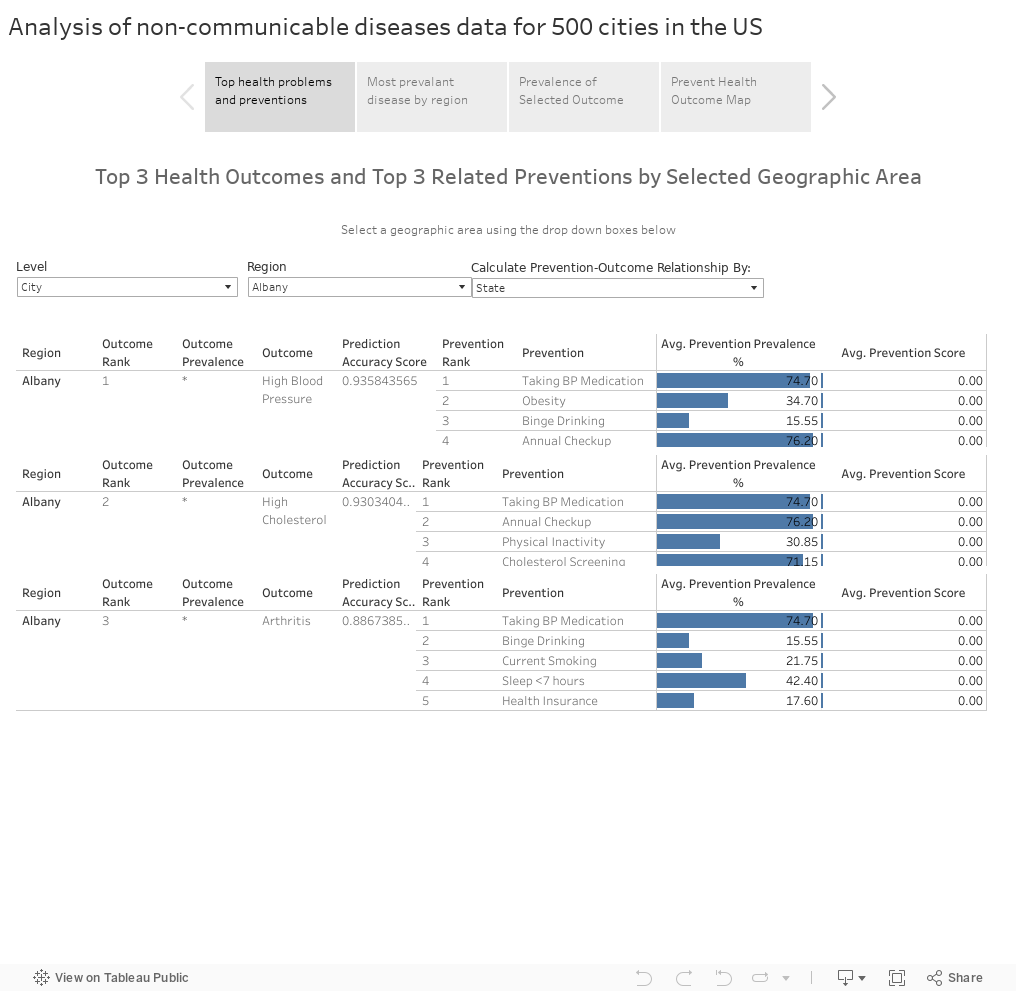
We analysed the data from CDC’s 500 Cities project which provides census-track level data.(a small geographical area defined for census-taking purpose).
The data include estimates of diseases’ prevalence, risk factors such as drinking, lack of sleep, etc. and preventative measures. The diseases are mostly non-communicable diseases such as heart conditions or arthritis. Some preventions covered by the data include cholesterol screening, mammography, and routine medical checkup.
We picked this dataset for our project because it was the first time that a public health dataset at such a granular level was made available to the public. It also allowed us to aggregate them into cities’ and states’ statistics, which would enable some interesting comparisons.
We used Scikit-learn to do the majority of the analysis. We distilled it to 5 most relevant factors for each disease, which we then visualise it Tableau, along with other findings.
Link to view the visualisation.
Link to view the poster.